Showing posts with label Image Bank. Show all posts

Tuesday, 21 October 2014

Multiple Exposure Image Bank


In this image multiple exposure has to put a location in someones face, to me this photo says that he is hiding from that place and this is due to the use of sunglasses (which hide your face), ad the use of black and white which brings quite a depressing vibe to the photograph. Elaborating on the idea of the sunglasses, the sunglasses hide his face which is covered by the location which is why I thought that he is hiding from the location. I like how his face is centred as it makes him the focal point of the photograph, which makes the trees and river also the focal point as they meet in the centre of his face.

In this picture the use of multiple exposure shows a sequence, the man and woman standing by each other, then following with a kiss. However this use of multiple exposure could express desire, this is because the part of them kissing is faint compared to the other part, suggest it is what both of them are thinking. The use of black and white makes this photo seem quite deep because that is the effect it has on me.

In this image multiple exposure has been used to put trees in a girls face twice over which I like, I like the colour in this image as it brings a very natural vibe to the photograph.  This photo to me suggest that her head is very busy and she has a lot on her mind because the forest part of this image is very clear, which enforces this idea more so. I like how beside the her face which is facing sideways it is white because this keeps the attention to the main part of the image, however i feel the image needed that bit of breaking up.

In this image the sea is more prominent than the girl concerning the multiple exposure and this to me suggest nostalgia and how she wishes she was there. Or it suggests that this is a memory for the person that is taking the picture and that it is their memory, and perhaps it is an old flame they never quite let go of. I like how the faintness of the girl also could be light hitting her head like sun and that is how both compare.

In this image the multiple exposure enforces the saying "music in, world out". This photograph reminds me of this because around the headphones the city becomes fainter and fainter. I like how the city is in colour in the boys head as it lets the viewers know what it is exactly. I think this picture has been toned down a bit and i like this it produces a sundown vibe which I think is really nice.


In this image the little boys head becomes a construction site and this reminds me of the idea of growing up as a construction site grows up and develops, which could be in relation to his brain. The little boy seems quite upset in this picture which suggest as his feelings and knowledge broadens, he is not happy with what he is learning about the world or his life. This is enforced through the use of black and white and the depressing vibe it brings to the photo.

Sunday, 19 October 2014

Slow Sync Image Bank


In this image the slow sync is very evident, the man remains sharp whilst the background is heavily blurred because of his movement, this is a very good demonstration of slow sync. I think this photo could of used more thought as it is very simple however it is still a good image to show slow sync.


I really like this image and I think it is a very good demonstration of slow sync. I like how this picture isn't just random but it shows a movement, the arm and card remains sharp whilst the blur following shows the movement. I like how this image has been put in black and white as it follows the same colors as the suit of card.


In this image slow sync is shown through a fair ground ride which I like as the slow sync shows how fast the ride is going, the people remain sharp whilst the lights blur around them and I think this is a really nice effect as I like the blend of colors. I like how this image is also taken from below I think it is different.

In this image the slow sync is shown through the subject of a car, however the image isnt as sharp is one aspect in comparison to other pictures, however its not so blurred that you cannot see what the subject of the image is. I like the mixture of colors in the blur and i like how smooth the blurring makes the picture look.

In this image the slow sync shows a fish swiming in an ocean, I like how the fish and the ocean are the same color and I dont know if this is just coincidence or through the use of slow sync. This image is like the first image in this bank, however I prefer this one as I think it is more aesthetically pleasing. The blurring and the background in this image to me suggests the fast speed the fish is going.


This image is very interesting as one part of the bird is very sharp whereas other parts are blurred demonstrating the speed of the wings as the bird tries to gain flight. I like how the wings seem transparent as they move. I like the use of the black background as it makes the white of the doves/seagulls wings and sharp body stand out.

Thursday, 9 October 2014

Personal Image Bank


1) In this image the make up is heavy and the picture has been put in black and white, I like this technique for this certain image as it defines her face more so and makes the eyeliner more prominent. I also like how the light hits in this photo so the way that the photographer has positioned the model.


2) I like the form in this image as it hits around the eye sockets and looks like make up. I also like the shadow that forms off the eyelashes as it makes them look bigger than what they are, this also goes for the lips. I like how everything looks bigger than what it is as it makes it more eye catching.


3) I like how in this image the model seems like a character and this is shown through cosmetics and materials used for cosmetics e.g. diamantes. I like that the photographer has made this a portrait as it draws more attention to her cosmetics, which is the focus of my project, media make up.

4) I like in this image how the photographer has put the portrait to the side as opposed to having it the right way up, this is something so simple, yet I don't see it a lot and I quite like it. I also like the use of colour in this image, I like how the bright purple clashes against the paleness of  her skin (which has also been done by the use of cosmetics).


5) I like how this picture has been taken, only capturing half of her face and that it is quite close up as it captures the make up so much more, you can see the detail in a clearer way. You can also see the contours and how they define a lot better. I  love the multiple colour used in this picture.


6) In this image the photographer has used multiple flash to create an effect that there is 3 people there, however it is the same person and you can see them pulling different poses. This isn't an editing technique but a camera technique. I like how the colour then spreads across because the initial image has expanded into 3.


7) In this image the photographer has recreated the character of the joker and I love this because it  makes a story in the photography. the photographer has also used costume and props to emphasise this. I also like how the back drop is dark as it foreshadows the character and lets the audience know he is evil.


8) I like in this image how the photographer has made the background quite dark which blends in with her costume, making the models skin stand out and her make up, which even though is heavier than none at all, still has an element of being natural. I also like how the model is centralised in this picture, making her face the focal point of the image as it stands out.


9) I love the use of colour in this photograph as it is a constant and the photographer has used an object which breaks it up, even though it is the same colour. I like how the photographer has used a model of pale complexion as it makes her stand out against all things yellow.


10) Like the photo above, I like how this photographer has used colour as a constant in this image and it doesn't even seem to range from different shades, to the naked eye it seems like they are all the exact same colour. I also again think that this looks good against the models complexion.


11) I like how this picture is in black and white, not through editing but through creation. This image is almost an illusion which I like as it seems like the photographer has tried to create two faces on one face. I like the backdrop being black as it brings the black face out more as it seems more curved. I like how it is also a portrait, drawing more attention to the illusion.


12) The photographer in this picture has used the material of glitter to make a heart on the models face, I like the choice of model by the photographer as the red glitter makes the blue of her eyes pop. I also like the dark back drop as it brings out her pale complexion, it hits against her skin quite hard and makes her stand out more, making her the focal point.


13) I like how the photographer has chosen to shoot this subject as a close up as it shows the make up in detail, you can see in this image that the make up on her lips is intact a mix of both paint and lip gloss, that differentiate through texture. The paint looking rough and the lip gloss looking smooth.


14) In this image the photographer has also chosen to use the technique of close up which I like as it draws attention to her eye more so than if it was a full body shoot. I like how the dimantes have been used and they are almost the same colour as the eye shadow, making them go well together and look really nice.


15) In this image the photographer has chosen to do a close up/ head shot of model. The photographer has also used form to cause a shadow on the models face , which gives a vibe to the audience that this has been shot outside. This is a nice effect considering the subject of the photo which is a woman covered in petals on her face, this suggests that she is growing as a person.


16) This photo is another photo which seems like an illusion, this is very much like the other one considering the black back drop which makes the illusion stand out more as it blends next to the white. I like the monochrome colouring on this picture. I also like how the painting has been carried on on her neck and it doesn't stop abruptly.


17) This image reminds me of face paint as it seems that a butterfly has been recreated, very much like you would find at a zoo. I also like how the model has been positioned, i like how her black hair fans out and contrasts against her complexion. I also like how quite pale make up has been used on her skin, not making it too bold.


18) In this image I like the use of glitter and I like the amount of the model shown as it illustrates that the use of glitter is consistent. I like the colour of the back drop also as the shimmer stands out against it making it 10x more interesting to look at.


19) In this image I like that it is a close up and seems very symmetrical in terms of the actual lips, it looks very precise. I like the clash of colours and textures also, the yellow looks very sold where the red looks runny like paint, I think this is a very nice effect.


20) in this image the model seems to have been spray painted silver and then had powder paint thrown all over her, I like the subject of her being multicoloured. I don't really like the portraiture of this image I would prefer if this was a close up image.


21) This image is very simple media make up and I really like it, i like the mixture of red and white, and I like that the white is block and not faded. I like how the teardrop is red like blood, which conducts ach

22) This image is very interesting to look at as it shows the extent of what make up can do, showing how a man can be transformed into a woman through the use of make up. I found myself covering up half the face to look at the image and try to believe it, it is a very good demonstration of what make up can do.


23) In this image I like the use of selective colour with the make up as it almost suggests how make up can bring one to life or in fact, colour a life. i like how the colour is drained from her face and that this image is purely of the bottom half of her face as it draws sole attention to her lips and nails, which is the aim of the photo.


24) In this image to model quite evidently has face paint on however i like this as it shows that a character has intended to be created, int his specific matter, a geisha has been created. I like how the photographer has considered the costume and location, it is very appropriate to the character that has been represented.


25) In this image one shade of colour has been applied from the models eyes to her cheeks, I like how in this image the colour stays constant and it blends very well with her complexion. I like how the photographer has chosen a black back drop as it not only makes the model stand out more but the colour of make up as well. I like the framing of this picture and how the photographer has chosen to exclude her hair, as it draws more attention to the make up aspect of this picture.

Tuesday, 7 October 2014

Animation Image Bank

 In this animated gif it shows the transformation into a butterfly being put on her face and photoshop has evidently been used to produce a 3d effect for the butterfly. I like how in this gif the position of the camera varies and as the butterfly appears, the camera zooms in. I like how black and white has also been used so the colour of the butterfly doesn't steal attention away from the technique of the animation. This gif also uses slight video .


In this gif it shows a deck of card which illustrates sequence. I like this as i like how the cards are also in various positions. I also think this is nice to watch as I like how more and more hearts keep appearing where they keep it in the same suit. I also like how it is consecutive because the numbers go up in sequence. These pictures have been edited to give them a vintage vibe which i really like.


In this gif it shows a person beginning their surf. This gif is a bit boring however it is a good way of showing an animated gif. The one think I do like about this gif is the waves, you can tell the pictures haven't been taken to far apart from each other which I really like. It looks as if it should be a video however you an tell the pictures have just been taken one after the other very quickly. I don't like how you can tell the camera was shaking because the background wavers.


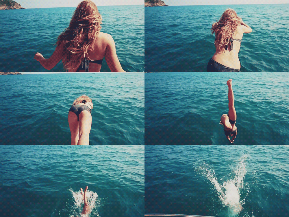
I love this gif because I like how it shows the process of a dive from start to finish. I also like how the camera follows her slightly, you can tell it does because to begin with you can see the sky and as the animation continues it disappears. I also like how the gifs is focused on her dive and not the aftermath because it does not bother to show too much of the development of the splash.

This gif acts as a timeline to show the process of how they turned a scruffy homeless person into a smart looking business man. I also like how this gifs goes quite quickly as it has a lot of frames, I also like how the last frame lasts for a bit longer than the others as it establishes the finishing product. I intend to do a shoot like this showing the process of my everyday make up.


This animated gif shows the cast of the hit show FRIENDS. It shows each of them twice pulling different poses, this animated gif acts as an establishment shoot. I like how each person is in a different position as it produces more of an establishment. I also like how this is in black and white as they all look quite young in this animation, showing that this show was filmed quite a while ago.

Tuesday, 30 September 2014

Location Portraiture Image Bank


In this image the sharpest part of the picture is the woman, I like how out of focus the green hills behind are as they seem to blend behind her making one big mass of green. I also like how some of the flowers remain sharp.  I like how this image has been kept natural and unedited as the location of this image is a natural area.

In this image the child is in focus and the grass in the background is out of focus, in this picture it seems like soft focus has also been used. I like how some of the grass is in focus as it allows the audience to know what the blur in the background is. I like the subtle colours in this image as I think it comes across quite natural and doesn't seem over edited.


In this image what is in focus is the woman and the cake she is icing, everything else is out of focus, making the woman and the cake seem like the focal point. The picture has been put in black and white, making the metallic blur in the back come forward in the image slightly, however not stealing the attention of the photograph.


In tis image the girl is in very clear focus and in this background the green is out of focus. As the green of the trees gathers around the woman, her complexion stands out against it which is a very nice touch. The grass below her is also out of focus and i like the colour scheme of this image. Even the clothing she has chosen to wear is very natural and nothing too out there, this fits the theme of natural.

In this image the background is so out of focus that I can't even make it out, however I like this effect as it makes the girl seem much sharper. I also like the composition of this picture, I like how she isn't in the exact centre of the photograph also because this picture doesn't even need rule of thirds to make her the focal point. The location portraiture does that itself.


In this image you can tell it has been edited heavily however I like this because it makes the picture seem magical as little sparks are flying, or at least that is what I see in this picture. I like how the rocks are out of focus in the picture because the are very big, yet the little sparks are so sharp, alongside the boys face as he watches them.

Blurring Image Bank


In this image heavy blurring is used to represent movement. You can see that the movement is very fast and perhaps quite sickly as the speed is taking place on a roundabout. I like this picture because I imagine it is from a child's point of view at which the shot is taken as they are watching their teddy bear spin around.


In this image the blurring displays a form of movement, you can see that the movement is quite swift as the blur circles around her as we assume she is dancing. I like this image because I generally like images of people moving within dance, I also like how you can see her torso as a constant, exaggerating the movement of her skirt and arms.


The blurring in this image shows movement, you can see that his legs are moving at a high speed as you can barely see them. I really dislike this picture because it is very unrealistic, the man is overweight and you cannot even see he is struggling as he moves at the speed he is, which would be difficult for anyone. This picture is ridiculous.


In this image blurring represents movement, you can see that she is moving quite erratically as her hand blur is very prominent and you can see her other hand by her abdomen which shows she has moved very quickly. I like this image because again it is a dance picture because I like how quickly she looks to be moving.


In this image the blurring shows movement and you can see how the 2 front people are moving leisurely, however are still moving in comparison to the other people. I like this image because for me it shows 2 people who are going through people and then 2 people who want to stay behind and relax to it. This photo shows 2 different kinds of people.


In this image blurring shows movement, you can see that both animals are moving at a fast pace however it seems that the mouse is going faster because the whole back of their body is elongated showing his blurred movement more. I like this image as I like how the chase is pictured and the main focus is how the main aspect of the chase is having speed.